With Westminster still reeling from the extent of prime minister David Cameron’s victory in last Thursday’s general election, two maps are making the rounds on Twitter that show just how much has changed (or not) in British politics in 2015.![]()
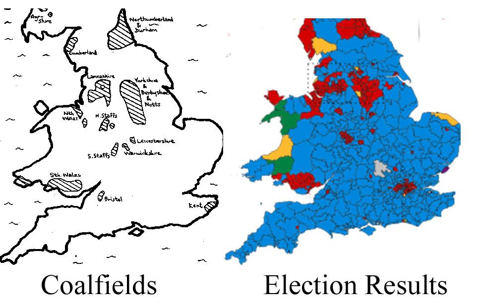
The first comes from Vaughan Roderick, a Welsh correspondent for the BBC, and it shows the legacy of Labour in what used to be the coal heartlands of Great Britain, underlining that Labour was unable to expand beyond its historical base there (and in London, which isn’t a former mining area):
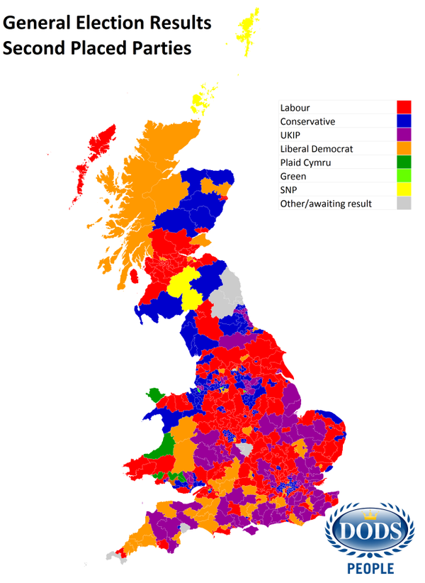
The second comes from Dods, and it shows the second-place winner in every constituency across Great Britain. It demonstrates just how strongly the United Kingdom Independence Party (UKIP) performed across England, where it pushed Labour and the Liberal Democrats out of second place in the south and where it pushed the Tories out of second place in the north. If — and it’s a big if — UKIP can maintain its relevance through 2020, it certainly has a strong base upon which it can make progress, especially if it makes a splash in the 2017 referendum over European Union membership. The map also shows the path forward for the Liberal Democrats’ rebuilding process, which should begin in Cornwall and the southwest.

